A brief titbit today, but one I felt was worth sharing and has come in handy for work/personal projects recently for me.
I’ve had a couple of requirements to gracefully show/hide and adjust web page layouts based on screen sizes (and screen re-sizing). I came across the following solution which works pretty damn well.
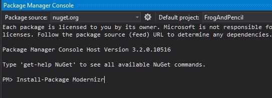
First things first, you’ll need Modernizr, which is in essence a feature detection javascript library. In this case, however, I’m using other features to react to browser re-sizing. There’s a few options for obtaining this for your projects but, as far as Visual Studio is concerned, I used the Package Manager Console using the following command:
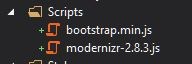
Once installed, we end up with the javascript library included under the default Scripts folder:
On installing the package, as I didn’t specify a specific version, I end up with the following declaration in my packages.config file (part of my ASP.NET MVC project) – 2.8.3 denoting the most recent version:
<package id="Modernizr" version="2.8.3" targetFramework="net452" />
Next up, simply chuck the usual script element into your page to reference the library – Now you’re all set!
<script src="~/Scripts/modernizr-2.8.3.js" type="text/javascript"></script>
The following snippet shows the basic scaffolding code to start capturing screen size changes (I’ve declared this code in my jQuery document ready function). The doneResizing function is tied to the window resize event and you can easily use Modernizr to read and react to the screen size as required:
//Function to react to screen re-sizing
function doneResizing() {
	if (Modernizr.mq("screen and (min-width:868px)")) {
		//Implement jQuery/JS to handle a larger screen (i.e. Laptops/Desktops). In my case adding/removing a class to show/hide elements
	}
	else if (Modernizr.mq("screen and (max-width:867px)")) {
		//Implement jQuery/JS to handle a smaller screen (i.e. Tablets/Mobiles). In my case adding/removing a class to show/hide elements
	}
}

//Call doneResizing on re-size of the window
var id;
$(window).resize(function () {
	clearTimeout(id);
	id = setTimeout(doneResizing, 0);
});

//Call doneResizing on instantiation
doneResizing();
Currently, I’m using this to show/hide element containers within a web page based on screen size (and apply/remove a few classes on the fly to ensure everything looks as it should on desktop, tablet and mobile displays). It appears to function very well, one worth investigating for your own projects. See here for the original Stack Overflow article detailing ideas surrounding this concept (including other CSS related solutions).
Bye for now!
 bearandhammer